Updated July 2026.
To coordinate colors and materials in a living room, apply the 60/30/10 rule: a neutral base for 60% of the room, a secondary color for 30%, and an accent shade for 10%. Mix at least three materials by playing with contrasts, and repeat each color in two or three places to unify the space.
The 60/30/10 Rule
This is the most reliable shortcut to building a balanced room. Colors are distributed in three proportions:
- 60%, the dominant color: large surfaces, walls, large rugs, seating. Keep it neutral and calming.
- 30%, the secondary color: an armchair, curtains, a piece of furniture, supporting the dominant color.
- 10%, the accent color: cushions, throws, objects, a livelier touch that brightens the whole.
This proportion avoids two pitfalls: a room that's too bland, all in beige, and a room that's too busy, where every color competes for attention.

Building a Lasting Palette
A successful living room palette relies on a few well-chosen colors:
- Start with a neutral base: off-white, beige, grey, taupe. It allows the space to breathe and ages well.
- Add one, or a maximum of two, colors: a deep green, a blue, a terracotta. Beyond that, the overall effect becomes muddled.
- Think of wood as a warm neutral: light oak or walnut pair well with almost any palette.
- A monochromatic scheme is a safe bet: several shades of the same color create depth without the risk of a design faux pas.
In a small room, keep lighter shades on large surfaces: we detail why in our ideas for furnishing a small living room.

Mixing Materials: Play with Contrasts
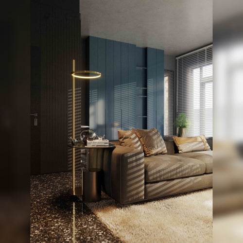
A room can be entirely in neutral tones and still be exciting thanks to materials. The secret: combine opposing textures. Aim for at least three different materials within view.
| Contrast | How to achieve it |
|---|---|
| Matte and glossy | A matte fabric, a brass lamp base or mirror |
| Soft and rough | A wool throw, a woven basket or rug |
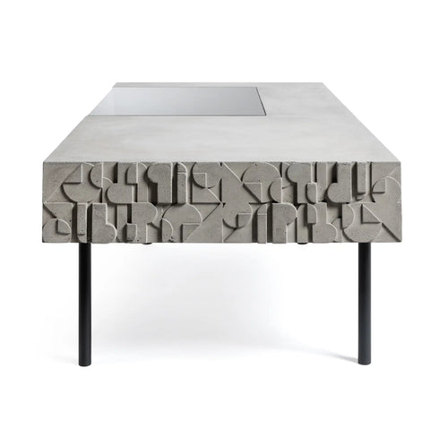
| Warm and cold | Wood and brass, versus glass and black metal |
| Smooth and textured | A smooth velvet, a knitted or boucle cushion |
Fenalor's tip: When a room feels flat and you don't know why, it's often missing a material, not a color. Add a woven element, a touch of brass, or a textured fabric from our cushions, and the room immediately gains dimension.

Repeat to Unify
The gesture that makes all the difference: each accent color should appear in two or three places in the room. A terracotta present in a cushion, a vase, and a frame creates a thread that the eye follows, giving an impression of coherence. Similarly, repeat materials, a little brass here and there, to link objects together. It's this subtle repetition that distinguishes a thoughtfully designed room from a mere accumulation.
Test Your Colors Before Committing
A color should never be judged on a three-centimeter swatch. Paint a sample of at least 50 x 50 cm on a piece of cardboard, then move it around the room and observe it at three times: in the morning, mid-afternoon, and in the evening under artificial light. Orientation changes everything. A north-facing living room receives cold, constant light that further cools greys and blues: it's better to warm up the palette with a beige, greige, or sand. A south-facing room, bathed in warm, changing light, can handle cooler shades without ever appearing austere. In the evening, everything changes again: a 2700 Kelvin bulb gilds whites and mutes greens. Our guide on light temperature room by room details this often-overlooked point.
The Touch of Black: The Anchor That Structures the Palette
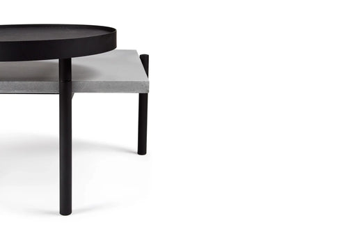
A living room entirely in soft tones can lack backbone. The remedy is simple: a small dose of black or very dark brown, around 5 to 10% of the room. A coffee table leg, a frame, a lampshade, a handle, or a lamp base is enough. This dark point serves as a reference for the eye, which then recalibrates all other shades: beiges appear clearer, whites sharper, the room better defined. The rule remains that of accent colors: repeat it in two or three places, at different heights, so that it reads as a choice and not an accident. A wall of frames with black borders serves this role very well, as shown by our rules for composing a gallery wall. Conversely, a single isolated black mass weighs down without structuring.
Frequently Asked Questions
How does the 60/30/10 rule work in decoration?
It divides a room's colors into three proportions: 60% for the neutral dominant color on large surfaces, 30% for a secondary color on furniture or curtains, and 10% for an accent shade reserved for cushions and objects. This balance avoids both a bland and an overloaded room.
How many colors in a living room?
Limit yourself to three main colors: a neutral base and one or two assertive shades. Wood and metal count as warm or cool neutrals. Beyond three colors, the room becomes muddled. To vary without risk, play with several shades of the same color, in a monochromatic scheme.
How to mix materials without making a design mistake?
Combine opposing textures: matte and glossy, soft and rough, smooth and woven. Aim for at least three materials in view, for example, velvet, wood, and metal. Contrast creates dimension, even in an entirely neutral room, without ever appearing disorganized.
What colors go well together in a living room?
Safe bets start with a neutral base highlighted with an accent: beige and terracotta, grey and blue, off-white and forest green. Light wood warms up all these palettes. For a reliable result, stick to natural tones and add a single strong color, in touches.
To compose yours, explore our selection for the living room, our cushions, and our decoration. To go further on textiles, see how to dress your seating with cushions and throws.